All you need to learn about CSS FlexBox
What is Flexbox?
Flexible Box Layout, also known as Flexbox, is a simple-to-use CSS layout module for developing responsive designs. It makes it possible for elements inside containers to be distributed, sized, and aligned in a dynamic and flexible way. Flexbox is especially helpful when creating layouts for responsive web design that must adjust to various screen sizes. It is a one-dimensional layout model.
Before Flexbox, there were four layout models. The Flexbox provides a lot of flexibility.
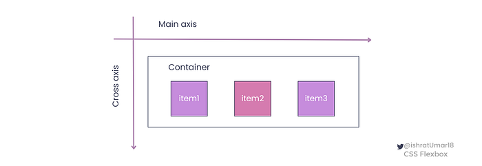
It has two entities:
✧ Flex Container
✧ Flex Items
To better understand the concepts of container and element, see the illustration below.
When to use it?
CSS Flexbox allows you to create responsive and dynamic designs. It is important to know when and where to use it to get the most benefit from it.
Here are a few common scenarios where Flexbox can be useful:
Layout in one dimension: Flexbox is particularly useful for creating layouts in one dimension, like rows and columns. For example, you can use it to make a horizontal navigation bar or a vertical sidebar.
Flexible sizing: Flexbox provides dynamic and flexible sizing of elements within containers. It can help designers create designs that change to fit various screen sizes and orientations.
Responsive design: Flexbox is designed for responsive design, making it easy to create designs that look the same on a wide range of devices.
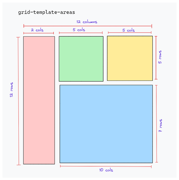
Grid layout: Flexbox provides an easy way to create simple grid layouts. It is not as powerful as CSS Grid, but it can be used in combination with it.
It is important to note that Flexbox is not suitable for all layout needs. It may not be the most suitable choice for creating more complex, multi-dimensional layouts. In those cases, CSS Grid might be a better choice.
Flexbox properties
Flexbox is a CSS layout module that offers a number of properties to help developers build responsive designs. The two categories into which properties can be divided are container properties and item properties.
1. Flex container
<div class=”container”></div>Flex container properties:
⇢ flex-direction : row | column | row-reverse | column-reverse
⇢ flex-wrap | no-wrap | wrap | wrap-reverse
⇢ flex-flow
⇢ justify-content
⇢ align-items
⇢ align-content
2. Flex items
<div class=”box box1”>item1</div>Flex item properties:
⇢ order
⇢ flex-grow
⇢ flex-shrink
⇢ flex-basis
⇢ flex
⇢ align-self
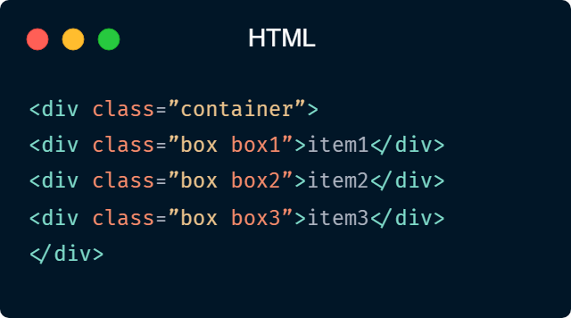
Example: This is a simple code example with 1 container class and 3 item classes.
HTML:
CSS:

The container will be a flex container, meaning its child elements will be laid out using a flexbox. The container has a 2-pixel solid border with the color #3A415C and a height of 100 pixels and a width of 300 pixels.
1. Flex container properties:
display
The display property is used in Flexbox to set an element as a flex container. It can take the value of flex or inline-flex, the first one for creating block-level flex containers, and the second for creating inline-level flex containers. You must set the display property for Flexbox properties to function in your project.
Using the Flexbox display property, you can make a simple navigation bar, as shown in the following example:
HTML
<div class="navbar">
  <a href="#">Home</a>
  <a href="#">About</a>
  <a href="#">Contact</a>
</div>
CSS
.navbar {
  display: flex; /*set the navbar as a flex container*/
  justify-content: space-between; /*align the items along the main axis*/
}
.navbar a {
  /*style the links as desired*/
  padding: 10px;
  color: white;
  text-decoration: none;
}
Keep in mind that this is just a simple example that creates simple navigation with a display property set toflex. The elements in the container are aligned on the main axis with space between them because the justify-content property has been set to space-between. You can create more complex layouts using a combination of other properties.
flex-direction
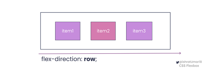
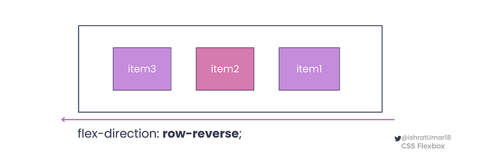
Using the flex-direction property of the flex container, you can specify the element’s direction.
✧ row sets the flex items to be in a row with the main axis running horizontally from left to right, and it is the default value.
✧ row-reverse sets the flex items to be in a row, but with the main axis running horizontally from right to left.
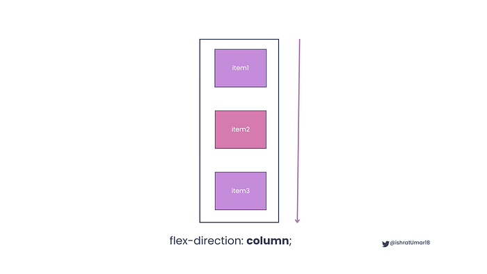
✧ column sets the flex items to be in a column, with the main axis running vertically from top to bottom.
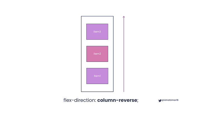
✧ column-reverse sets the flex items to be in a column, but with the main axis running vertically from bottom to top.
flex-wrap
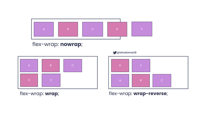
The flex-wrap property is used in Flexbox to specify how flex items should wrap when the total size of the flex items is larger than the size of the flex container.
✧ nowrap is the default value of the flex-wrap property which means that if the container does not have enough space, the items will overflow.
✧ wrap value indicates that the flex items will wrap onto the new row if required
✧ wrap-reverse value indicates that the flex items will wrap in reverse order if required
To better understand the property, see the illustrations of nowap , wrap and wrap-reverse below.
flex-flow
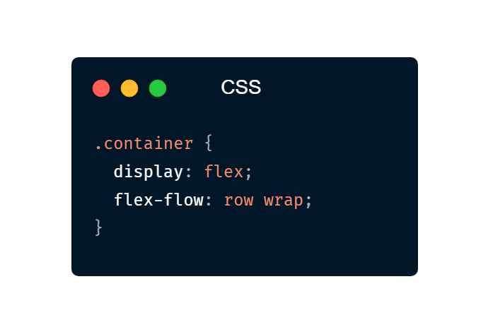
Theflex-flow is a shorthand property for flex-direction and flex-wrap properties.
Example:
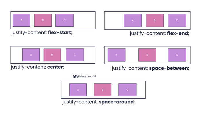
justify-content
The justify-content property determines the alignment of items along the main axis.
✧ flex-start is the default value, and it is used to align the flex items to the start of the main axis.
✧ flex-end is used to align flex items to the end of the main axis.
✧ center is used to center flex items along the main axis.
✧ space-between is used for evenly distributing flex items along the main axis, with the first item aligned to the start and the last item aligned to the end.
✧ space-around is used for evenly distributing flex items along the main axis.
align-items
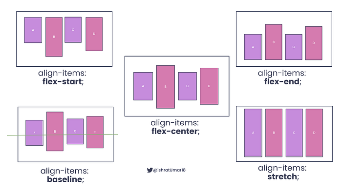
The align-items property determines the alignment of items along the cross-axis.
✧ flex-start is used to align items to the start of the cross-axis.
✧ flex-end is used to align items to the end of the cross-axis.
✧ center is used to align items to the center of the cross-axis.
✧ baseline alignment arranges the flex items in such a way that their baselines are in line with each other.
✧ stretch is used to stretch items to fill the container along the cross-axis.
align-content
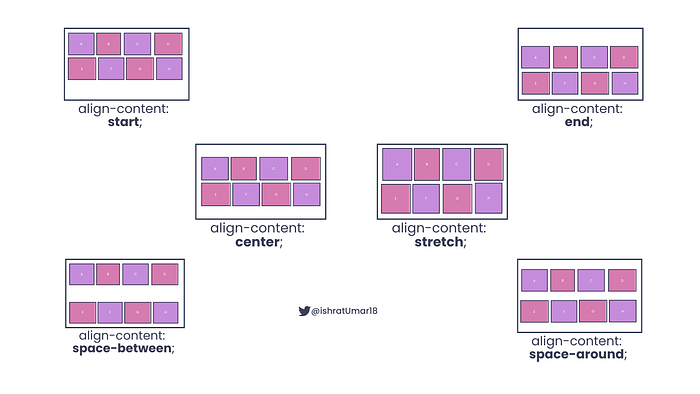
The align-content property is used to align content along the cross-axis.
✧ start is used to align rows to the start of the cross-axis.
✧ end is used to align rows to the end of the cross-axis.
✧ center is used to align rows to the center of the cross-axis.
✧ stretch is used to distribute rows evenly between the start and end of the cross-axis.
✧ space-between is used to distribute rows evenly with equal space around each row.
✧ space-around is used to stretch rows to fill the container along the cross-axis.
Flex Items
✧ order
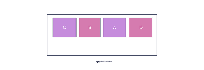
The order property allows the rearranging of flex items and must be a numerical value, with 0 being the default.
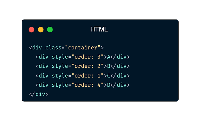
Illustration:
✧ flex-grow property sets the value by which a flex item will grow compared to the other flex items.
✧flex-shrink property sets the value by which a flex item will shrink compared to the other flex items.
✧ flex-basis property determines the starting length of a flex item.
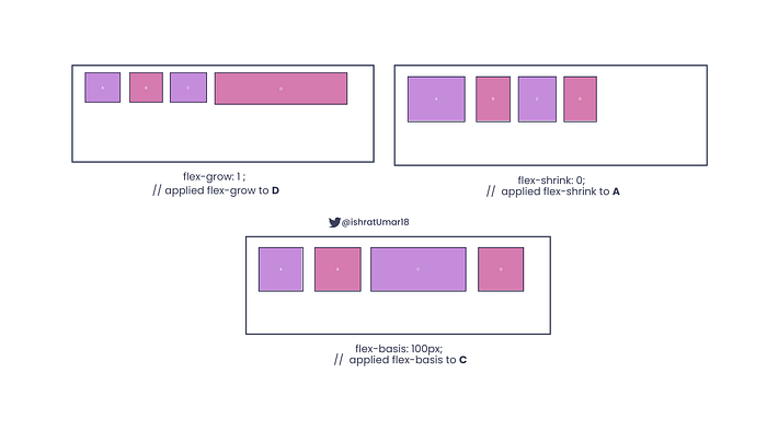
✧ flex property is a shorthand for the flex-grow, flex-shrink, and flex-basis properties.
Example:
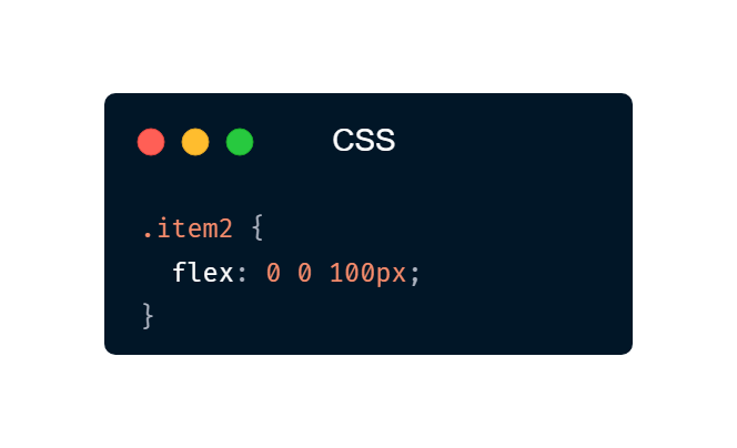
The element of the classitem2 will have a starting width of 100 pixels, and it will not grow or shrink in size relative to the other flex items in its container.
✧ align-self
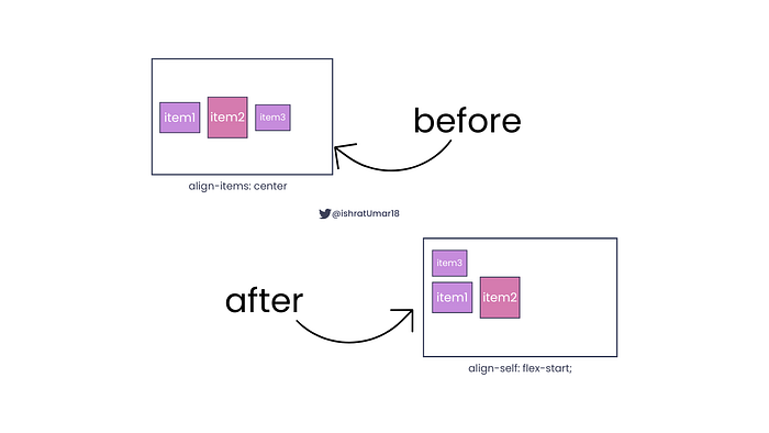
The align-self property is similar to the align-items property that is used for Flex Container, but it is applied to individual Flex Elements. It overrides the default alignment set by thealign-items property.
It can take the following values:
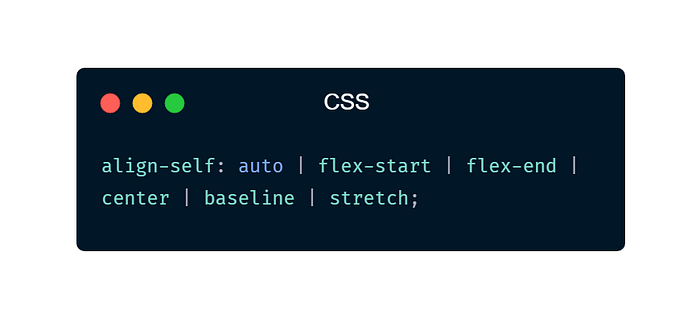
Take a look at the example below to see how to use align-selfto align a single item in a flex container differently from the other items:
.flex-container {
  align-items: center; /* align all items in the container to the center */
}

.item3 {
  align-self: start; /* align item3 to the start of the cross axis */
}
In this instance, by default, all items in the container will be aligned to the center of the cross-axis but item3 will be aligned to the start of the cross-axis.
Additional resources for learning Flexbox
Learning Flexbox can be challenging, but there are many resources available to help you get started. Here are some additional resources that you can use to learn Flexbox:
MDN Web Docs has a comprehensive guide on Flexbox, which covers all the properties and concepts in detail, with examples and interactive demos.
Flexbox Froggy is a fun and interactive game that teaches you how to use Flexbox properties. It’s a great way to learn Flexbox in a playful and engaging way.
CSS Tricks has a number of articles and tutorials on Flexbox, that cover a wide range of topics and use cases. This is a great resource for learning more advanced Flexbox concepts and techniques.
Complete Web Developer in 2023: Zero to Mastery a very popular and well-reviewed coding bootcamp that has received excellent reviews. You have the option to start out as a beginner this year and end up as a great developer at Zero to Mastery.
Wrap up
I really hope that this article will give you a strong foundation for understanding Flexbox. Remember that Flexbox is a powerful layout tool, and it takes practice to master it. The more you work with Flexbox, the more comfortable you’ll become with it and the more you’ll be able to create with it.
Thank you for reading it! If you have any questions, ask me on Twitter. Also, like and share it with others.
Follow me on Medium ,Twitter ,GitHub ,Hashnode, and DEV.to for web development-related content.
Happy learning!

